Monday 28 March 2022

Women's Well-Being Magazine Final Product

 Final Product of Magazine-

This blog post will be focusing on the final copy of my magazine. It will display what changes have been made since developing and receiving feedback of each page within my magazine. 


Link- Women's Well-Being Magazine

https://www.canva.com/design/DAE6nNmeWKk/tGxSmaakGRv3554J6j0Hpg/edit?utm_content=DAE6nNmeWKk&utm_campaign=designshare&utm_medium=link2&utm_source=sharebutton


Second Double Page Spread Feedback

 Sports and Fitness Double Page Spread Feedback-

This post is going to be discussing and going over feedback that I received from my Google forms for my sports and fitness double page spread.


This double page spread does not seem to have a lot of things that need to be changed about it. Most feedback that I received for both pages was very positive and supportive of the specific page. One person said that I should brighten the photos and adjust certain features of the photos to make the images pop. I felt that this was a very good response because it will help brighten my magazine and draw more attention towards the images. All in all, this page won’t need many changes before the final draft.

Double Page Spread Feedback

 Double Page Spread Feedback-

This blog post will consist of my analysis and take away points from the feedback that I received from my peers. I received this feedback through a survey that I sent out and created it on Google forms. I will be looking into my feedback which will impact changes I make before finalizing my draft.


For the first page of my double Page spread with Kiera Muray I only received one critique for feedback. The person who answered this response was not a huge fan of the layout of the first page. however, all of the other responses were very fond of the look of this page and even liked the color scheme and simplicity of it. I feel that there could be a few things I could add to this page that would make this page more appealing for more people.


For the second page of my first double page spread there were a lot of critiques. The most commented critique was making the text more easy to read. however, I felt that since the previous page was so simple that there would need to be a decent amount of text on the following page and I had made sure that the font was big enough to make it more simple to read for readers. One comment said love everything no flaws and one said it doesn’t match with the rest of the theme. these two comments are complete opposite opinions. As in regards to the theme I felt that this page match the color scheme but went along with the theme in the direction of women empowerment and giving a personal example of a successful, active, and healthy young women. This article relates to the theme because it also addresses issues about how this specific celebrity or athlete battled common issues among women and teens and how she coped with them. After reading the feedback I feel that there are some tweaks that I can make to make the text easier to read and the color scheme blend more together. 

Table of Contents Feedback

 Table Of Contents Feedback- 

This post will consist of analyzing feedback I received from a survey that was sent to a few of my peers. their responses could affect the changes or outcomes that come with my final draft. This survey was created on Google forms, allowing me to get anonymous feedback. Each response will allow me to reflect on something different about the contents page and what should stay and what should go.


In conclusion of my feedback for my contacts page, I believe that most feedback I received was positive. There were concerns about changes within the photos or font. However, I would not change much with my contents page as of right now because I felt that the font fit the genre best out of my options available. I also felt that the photos used for my contents page fit best out of my options and gave a variety of scenery, which is what I wanted my magazine to consist of. I feel that I could change and adjust settings among the photos in the contacts page to make them fit better together. The feedback that I received for my contents page gave me ideas on what to tweak for my final draft and gave me reassurance for the layout of my contents page.


Sunday 27 March 2022

Developing My Celebrity Feature

Celebrity Feature Page Rough Draft-

For this post I will be explaining how I developed my celebrity feature page. I will also be going over who is featured and what platforms are used to create my page layout.


For my celebrity feature page I decided to use a friend of mine Marissa Marril who has gained a large following based on her studies towards teens mental health and what is impacting their mental health so greatly. I interviewed Marissa and took photos of her for my magazine. She shared some of her favorite quotes with me, explained to me why she believes teen mental health is so impactful, and how she takes care of her own mental health. 


I created the layout for my celebrity feature page on Canva. I looked through templates that were available on Canva and I incorporated multiple templates that stuck out to me into one page. I added colors that fit my color scheme and the background of the image that I took of Marissa at the Miami selfie museum.


Developing My Second Double Page Spread

Sports and Fitness Double Page Spread Rough Draft-

For this post I will be going over how I created my double page spread analysis for my sports and fitness section of my magazine. 


I decided to do my double page spread on sports and fitness because I felt that it is an important role in a women’s health and wellness magazine. I designed my double page spread on Canva. I used to shapes and fonts that fit my magazine style and that were accessible to me on Canva. I had an idea of what I was going to do for my sports and fitness section of my magazine because I was really inspired by the women’s health double page spread on sports gear. I loved the layout and I felt that it would be perfect for my magazine if I tweaked it a little bit.


For my sports section I decided to use images of Kiera Muray playing volleyball that I used in her double page spread. I felt that since the readers had already read about her they would understand more about getting involved in sports. On the side bar I talked about why getting involved in sports can positively impact you and underneath the images I talked about how you could find a sport that would be good for you.


For my fitness section I decided to use images that I took of Marissa Merrill working out at planet fitness in Margate Florida. On the side bar I went over how you can easily access fitness not only through a gym but through your home or wherever you choose. In between the images I also included a small paragraph of who Marissa is and why she is featured in these images.


For each image I had put a blue or pink film over them so that the images would go along with my color scheme and allow my magazine to continue to have an organized look. 


This is still the rough draft for my second double page spread on sports and fitness and I will make changes after receiving feedback from my peers.


Developing The Cover Page

 Cover Page Rough Draft-

This post will go over how I developed my cover page, what platform I used to design both covers, and why I couldn’t choose between the two.

The two photos shown below are two drafts that I was fond of for my magazine. both photos were taken at the Miami selfie museum but, I couldn’t decide which model to feature on my cover. I loved the lighting and the layout of both covers. However, I am leaning more in favor towards the first cover page featuring Kiera Murray because she has a double page spread about her and the lighting in the image that she is in fits the color scheme and brings out her features more than the one of Marissa Marill. my final choice for which cover page I will be using will be after I get feedback and advice from my peers. 

I used Canva to create both cover pages. The cover page that features Kiera was inspired to have a more modern look and to allow the text surrounding her to pop. However the cover page featuring Marissa was decide to have a more simplistic look due to the difference in the lighting and their physical representation of themselves. I have not made a final decision yet about which page I will be using but, I will decide after I get feedback back.


Developing My Table of Contents

 Developing Table Of Contents Page-

This post will be discussing how I developed my rough draft for my table of contents page.

Most table of contents pages that I saw examples of included photo collages with the page number on the inside of the photo or the outside. I liked the idea of this layout because I felt that it was very tasteful to the eye and allowed more colors to pop. I used photos that I had taken throughout the process of making my magazine that fit with the color scheme best and that were possibly shown on pages within my magazine. I made my table of contents page through Canva which allowed me to view examples of other magazines and choose different shapes or styles to include in my contents page. 


Magazine Rough Draft (Before Most Feedback)

Magazine Rough Draft-

This is my rough draft for my women’s well-being magazine. This magazine draft has two cover pages because I could not decide between the covers. It also has a table of contents page, a celebrity feature page, and two double page spreads. This is my magazine before feedback from my peers. I expect to make many changes after receiving feedback but, this draft is generally what the final copy will most likely resemble.


Thursday 17 March 2022

Cover Layout Feedback

 Cover Layout Poll-


When I was designing my magazine I had to come up with two separate covers. I was torn between which one that I felt best fit with my magazine and looked the most professional. I wanted to make the best decision possible so I decided to make a poll on my Instagram account and have some of my followers vote on which cover page they liked best. 

According to the pole the top cover shown on the image below was the winner. This photo One by 89% and received 16 out of the 18 votes. I felt that this was a good way for me to receive feedback on this because it didn’t take away from my followers time and was easy to respond to.


Tuesday 15 March 2022

Developing My Double Page Spread

 Developing My Double Page Spread-

In this blog post I will be going over how my double page spread was developed and what helped inspire the layout that I used on the spread.

I decided to create my magazine on Canva. Canva gave me access to multiple templates of many different types of magazines. I decided to go with my original favorite color scheme which incorporates teal, pink, white, and black. The images that were within my magazine were already edited and discussed in one of my previous blog posts.

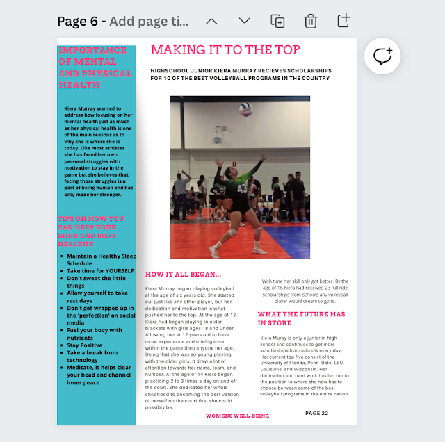
My double page spread was about a young athlete and what led up to her success. It also includes advice about mental health and physical health. 


There is still room left for improvement for this spread but, as of right now my final draft will look almost identical from the spread shown, aside from a few possible tweaks.

Below this text are some examples that were used as inspiration when creating this spread.


Sunday 6 March 2022

Mini Photoshoots

 Separate Photoshoots-

The images shown below are photos that I plan to include in my double page spreads within my magazine. I still have more images to capture but, these photos will most likely be featured in my magazine. Being that these images were taken with the model and I individually in separate locations, I will include where the photos were taken and which model is featured.


Kiera Murray-

These images were taken in my backyard by the pool and I selected three of the best images from the photoshoot. These photos were edited an app called 'Prequel' and they use a filter called 'Indie Kid'. I felt that this filter was best for these images because they allowed the background to have more saturation and gave my model a tanner look. 


Kiera Murray-

I plan to include a featured sports/athlete section in my magazine so I went to Kiera's game on Saturday March 5th and took some photos of her playing volleyball at a tournament. The first two images show Kiera Murray serving and the images are unedited. I decided to use a filter on an app called VSCO. I felt that the filter called SSI allowed the image to look best, which is shown in the third and fourth images.


Florida Sunrise-

I plan to include a section or a side bar with ways to help your mood and your mind well being. I plan to include a section about the positive side effects of waking up early and getting a good head start on your day. I went to the sunrise last weekend in Boca Raton Florida and the photos of the ocean that I had taken show how much a breathtaking scenery can be an excellent kick start to your day. I am still unsure if these images will be used but, I would like to add them to this post as a reminder for what I would be able to use them for.


There will be more images that I plan to take for my magazine but, the ones that are shown within my blog post are more likely to be included. Not all photos taken from each photoshoot will be included in the blog post, only the images that show the best potential will be posted.

Thursday 3 March 2022

Miami Selfie Museum Photoshoot

 Photoshoot Results

This post is going to display some of the images that were taken at the Miami Selfie Museum. One of these images will used on the cover of my magazine and a select few other images from this shoot will be used elsewhere in my magazine. These images were taken inside specific sections of the museum, which was discussed in my previous blog post. I brought three of my models with me to the museum and they are shown in the images below.

Lighting-

The lighting at this museum was spectacular and it allowed the photos that I took to really stand out due to the professional lighting setup. I had my models take photos in a few different sections so, I would be able to have multiple backgrounds to choose from. This allowed me to have a broad range of photos and also saved me time because I did not have to set up the the backgrounds. 


Marissa Marill-


Kiera Murray-


Jersey Liuzzo-


Creative Critical Reflection 2

 CCR #2-  How does your product engage with audiences and how would it be distributed as a real media text? For my second Creative Critical ...