Monday 28 February 2022

Looking For A Photo Museum

The Miami Selfie Museum

 Since my most recent photoshoot did not go as successful as planned, I decided to look for a photography studio near me. I wanted to find a studio because I felt that I could get a more professional look than I would get if I were to take my photos at home. Not only would my images look better because of the professional lighting, it would also allow me to have access to multiple types of scenery without spending an excessive amount of money.

After excessive research I had found the perfect museum and it was only forty minutes away from my house. I had found The Miami Selfie Museum while scrolling through my Instagram. I was skeptical at first because it is somewhat far and it costs 29 dollars for each person. However, I knew that this would be the best opportunity I would have to take photos that match my color scheme and have a very professional look. There was no doubt in my mind that I wouldn't get amazing photos at The Miami Selfie Museum after seeing their personal social media platforms. The admission was 29 dollars but, luckily my models were willing to pay for themselves because they looked at this as a perfect opportunity to get cute pictures for their personal social media platforms. 


As you can see from their Instagram, the images taken at this museum are very professional looking and they're are many different styles of backgrounds to choose from. After looking over their Instagram and prices I had decided to take three of my models with me down due The Miami Selfie Museum on Saturday  February 26th.


Citations-
https://www.instagram.com/miami.selfiemuseum/?hl=en
https://originalselfiemuseum.com

Photoshoot Gone Wrong

  Today I am going to be discussing how my gym photoshoot did not succeed and what steps I can take to better the results of my next photo shoot.

My first photoshoot was at Planet Fitness and they were images of my Model, Marissa Marill Working out. Since the results of my survey showed that one of the top picked locations for a photoshoot was the gym, it was the first place I intended to capture my images.

Unfortunately, Planet Fitness is not the best place to take images in. The lighting was not the best inside this gym. There were way too many people that would walk by and the scenery did not math my color scheme.

All photos that will be shown in this blog post are unedited and are the original images from the photoshoot at Planet Fitness. I had chosen five images out of the photoshoot that I believed might have some potential with editing. These images will not be used as a potential cover but, they could be useful if I were to do a section that demonstrates workouts or an advertisement for this specific gym.


The two images shown above have some of the most potential and could be used as a Planet Fitness advertisement in my magazine. The lighting was the best in these two images and they could be edited to make them look more professional, which would make them a possible option to be used in my magazine.


Both images that were taken in front of the window did not turn out the way I had expected them to. They turned out blurry and dark due to the gloomy outdoor lighting and the poor lighting in that section of the gym. However, these images could have potential using the proper editing.


This image shown above would only be used in my magazine if I were to make an advertisement for planet fitness or gaining access to a gym membership. I believe it is a good example of what exercise machines are accessible in this magazine.

Take Aways-
  • Look for perfect natural or artificial lighting
  • Research some professional photoshoot locations
  • Make sure my model is focused
  • Take more images than you think you will need
  • Make sure the background matches the color scheme
  • Take images in portrait if there are people in the background

This photoshoot has allowed me to take away what to do and what not to do for the next photoshoot I will have. I would like to find a location with excellent lighting that allows me to capture my models natural beauty. I now know that this gym does not have the best lighting and in order for my next images to become more presentable I have to take all factors that could degrade my images.

Friday 11 February 2022

Color Scheme Research

Color Scheme Research-

 This blog post is going to be about color research. I will be researching about color and color palettes to use in my magazine. I will be using this research to establish a color palette that matches the tone that I would like my magazine to express.


I would like my magazine color palette to be simple yet attention grabbing. The colors green, red, and blue resemble fitness. Colors that resemble women are green, white, and purple. After researching and discovering that green is a common color between the resemblance of fitness and woman, I decided to look into using the color green for my titlepage. However, I quickly discovered that green is the least common color used in magazines.


Since green didn't seem to be a popular color among magazines, I decided that I would look into colors that were popular for marketing and colors that statistically show better reviews from consumers. I found a website which is linked in the bottom of the page that says women prefer subtle tones of purple, green, red, and blue. In fact reading this article had taught me that blue is actually the universal favorite between men and women. Even though my magazine is directed towards mostly women, it doesn't mean that it can't grab the attention of men as well. I originally had wanted to use the color blue because I feel that blue is a commonly liked color, it stands out, and I have seen it used on other fitness magazines that are used as examples in previous blog posts. However, this research has made me realize that I will most definitely be using blue within my color palette because it is a highly liked color and it can help grab the attention of my readers.


I plan to use blue as the color of the text on my cover page. however, I do not want the entire color scheme of my magazine to be just blue. I would like to incorporate some other colors that go well with the color blue that I decide to use. So, I decided to go onto colors.co and look up color palettes to try and find the one that would best fit the tone that I would like the colors in my magazine to reflect.


Color Palette1-


Color Palette 2-


Color Palette 3-


Color Palette 4


Color Palette 5-


Color Palette 6-


Color Palette 7-


I feel that most of the color palettes would fit my magazine well but, that the color palettes that would resembles my magazine best would be palettes 1 and 7 would resemble the tone I am looking to give off in my magazine best. I cannot make my final decision until I have completed all of my photoshoots and planning the layouts within my magazine. But, I will most likely be using color schemes 1 and/or 7 in my magazine because it resembles trust, fitness, and the colors used within these two palettes are shades of two of the most popular colors used in magazines.


Citations-

https://coolors.co/palettes/popular

https://neilpatel.com/blog/psychology-of-color-and-conversions/


Personal Timeline

 Timeline-

Today I will be creating my timeline for my project. This purpose of this post is to make sure that I do not fall behind on my blog posts, photoshoots, and the creation of my magazine. I will be planning and managing my personal deadlines that I would like to have everything completed by. I would like to have everything competed before the deadline so, I can have time to make necessary adjustments without having the stress of last minute changes and fixes.

Today is February 11th, so my timeline will start from today and on. I currently have 9/30 blog posts completed, making this my 10th.

2/11- Have 3 posts done for the week

2/12- Get supplies for DIY photoshoot backdrop.

2/13- Have at least two of the photoshoots completed.

2/14- Create a blog post about the first few photoshoots by 11:00pm

2/15- Have all favorited images from the photoshoot edited.

2/12-2/18- Have at least 3 new blog posts completed

2/19-2/25- Create 5 blog posts for the week

2/25- Begin designing the cover photo for magazine.

2/27- Have Completed Cover for Magazine.

2/28-  Begin designing Table of Contents Page

3/2- Complete Final Table of Contents Section

3/3- Start Brainstorming for Double Page Spread

2/28-3/4- Create 5 blog posts this week

3/6- Complete Double Page Spread

3/7-3/11- Create 5 blog posts this week

3/13-3/15- Create 3 new blog posts.

3/15- Have 30 or more Blog Posts Completed

3/15- Look over magazine and make sure grammar and layout is correct.

3/16- Have 5 classmates review my magazine and ask for constructive criticism

3/17- Make final changes to the magazine depending on feedback received.


Finish by- 3/18 (my goal)

Class Deadline- 3/28 

Wednesday 9 February 2022

Photograph Lighting and Background Planning

 Planning  Magazine Photography 

Today I'm going to be researching and planning out how I am going to take my photographs for my magazine. In this blog post I will be focusing on what lighting I will be looking for and how I can make each photograph more professional.

My initial idea was to have simple images with a white backdrop, so my models can stand out and be made the main focus. However, not all of my images will be displayed on a white backdrop. Because of this I need to plan out where I want each image to be taken place and what some recommended locations would be for a fitness photoshoot.

Previously in my other blog post, some of my survey responses had said that they had wanted or recommended images to be taken in the gym or a park. Taking this into consideration, It has allowed me to come up with some ideas on where I want specific images to be taken.


Cover Photo and Advertisment Lighting and Setup-

I would like my cover to have a simple background but, I do not want my background to be bland. Since I was skeptical on how that I could make my vision a reality, I decided to look up some simple DIY backgrounds for photo shoots.


Creating a DIY Photoshoot-

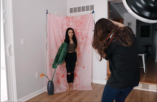
I found a youtuber named Jessica Kobeissi who created her own DIY photoshoot studio using material she had at her house.


There are many YouTube videos on DIY backdrops and tips on how to get professional looking photographs. This one specifically stuck out to me because it had the exact idea I was looking for and it is easy and inexpensive to create. Other videos showed different ways to get backgrounds but a lot of them required a large amount of editing and were expensive.


Materials needed for DIY simple background-

·      Table Cloth 

·      Paint

·      Rope or wire

·      Tape

·      Camera

·      The tablecloth needs to be hung in the corner of a room with open lighting like the image shown above


I would use this background for my cover image and I would also use this concept for all of the fitness products that I would be advertising. This DIY YouTube video showed me how to create a simple background for photos in my magazine. Not all images that I take will use this background but, it will allow me to create and have access to more backgrounds then I had originally thought of. 

I still plan on incorporating images using gym equipment, taking photos at a park, and analyzing which images will look best and fit the style of my magazine. 


Photographs that are taken outside will mostly rely on natural lighting And editing. However, since not all of my photos will be taken outside this research has taught me how I will be able to conduct a professional photo shoot inside.


Ways to Improve Lighting-

1.    Broad Light Source (softbox or umbrella)

2.   Place Light Source Close to your subject

3.   Use front lighting when taking images of models because it helps to hide blemishes and scars that may stick out.

4.   Including a three dimensional look to add life to your pictures and give exam a voluminous look

5.   Keep color temperature in mind while shooting.

6.   Experiment with lighting because you may have to try different things until you get the look you want.


I also did some research on ways to improve lighting or what to focus on when I am taking photographs. The list above consists of ways to improve my lighting and what to mess around with in order to get the perfect image. Conducting this research answered a lot of my questions about how I would set up each photo shoot and how lighting will play a role in each individual image. It has also helped me understand what to expect and how to troubleshoot any problems that I may face.


Citations-

https://www.picturecorrect.com/tips/5-lighting-tips-to-improve-your-photography/

https://www.youtube.com/watch?v=1EwInWC3Flc

Tuesday 1 February 2022

Double Page Spread Analysis

Double Page Spread Analysis 

I was assigned to create a double page spread analysis for three magazines within the genre of women's health and fitness. I have chosen three double page spreads from Women's Health Magazine, First for Women's Magazine, and Woman's World Magazine. Each spread is a different example of a popular subject within my genre.

Women's Health Double Page Spread Analysis

January/February 2022- Fitness Feature


First For Women Double Page Analysis Spread-

February 2022- Cover Feature


Woman's World Double Page Spread Analysis

January 2022- What's Trending This Week


Magazine Contents Page Analysis

Magazine Contents Page Analysis

I was assigned to select three magazines in my genre and analyze their contents pages. I have chosen Women's First Magazine, Woman's World Magazine, and Woman's Health Magazine. I have selected these three magazines because they all fit in with my genre of Women's Health and Fitness but, have different types of designs and layouts. I felt that analyzing different types of magazines would give me a better general understanding of what to do with my own contents page. Each magazine has allowed me to take away from features I plan to incorporate in my contents page and features that I will refrain from using.

Women's First Contents Page Analysis

February 2022- Valentines Day Edition


Woman's World Contents Page Analysis

January 2022


Women's Health Magazine

January/February 2022


Magazine Content Survey

Women’s Health and Fitness Magazine Questionnaire-

I was assigned to conduct research on my target audience and other aspects of my magazine. I decided to use Google forms and send the link to people who fit the general target audience description. I asked questions that would allow me to better understand how to design my magazine and what others would prefer to see.


Based on the responses I have received, the top two names are Women's Health + Fitness and Women's Well-Being.

This poll has given me a wider range of ideas as for what will be included in my magazine content. 


According to my poll, the most popular color scheme is purple in white. However, I plan to use teal, white, and light purple in my color scheme.

All of these locations could work for my magazine's photoshoots but, the most popular one seems to be the beach.

According to my survey, Nike easily won the poll as the go to athletic wear.


I decided to include a personal question in my survey to possibly see what are some go to healthy snacks that are popular among my target audience so, I have an idea of what type of healthy recipe to include in my magazine.

I also asked what motivated the people who took my survey. Some responses were not serious but others gave me a general idea on what could keep a positive mood within my magazine.
Almost all responses to this poll were gym clothes. I will still take images of my models in different outfits in order to see which looks best.
Since, this question had a variety of responses I have decided to leave the hairstyle choice up to my model because she will know which style she feels most comfortable in.
With majority vote, I have come to the conclusion that my cover model will be an athlete
This poll has given me a general idea on what to use as my cover article.

Creative Critical Reflection 2

 CCR #2-  How does your product engage with audiences and how would it be distributed as a real media text? For my second Creative Critical ...